

Written, Not Printed: Kanji Meanings in Fashion
, 2 min Lesezeit
, 2 min Lesezeit
Kanji in fashion, read properly — what 無, 龍, and 調和 actually mean, where printed characters go wrong, and how to wear one like you chose it.
A slogan explains itself. A kanji doesn't — and that's the entire appeal. One character on a chest panel can hold an idea that would take an English sentence to unpack, which is why kanji keeps returning to fashion decade after decade. It's the densest graphic language available to a garment.
But density cuts both ways. A character chosen for its shape says nothing, and everyone who can read it knows. The difference between kanji as design and kanji as decoration is simple: whether anyone involved can tell you what it means and why it's there.
We can. Every character Obrava prints has a page in The Kanji Library — meaning, origin, and the garment that carries it. These are the three in the current lines.
The negation character — Japanese for without. On its own it points at nothingness, and in Zen it's the answer to the tradition's most famous koan: not yes, not no, a refusal of the question's frame. In design terms, 無 is the argument for negative space — what you leave out shapes what remains. It anchors the Shinsei Void series. Read the full entry.
The traditional sixteen-stroke dragon — older and heavier than the simplified 竜 used in everyday print. The East Asian dragon is a water spirit and a symbol of wisdom and rightful power, not the fire-breathing monster of Western stories. Its visual density is why it survives in calligraphy and textile work: written large, it reads as an image as much as a word. It marks the Kanji Dragon line. Read the full entry.
Two characters: 調, to tune, and 和, harmony — together, balance you make rather than balance you find. It's the honest word for how a good garment works: silhouette against fabric weight, graphic against empty space, everything adjusted until it holds. It's carried on the Shinsei Chōwa tee. Read the full entry.
Characters printed backwards. Characters that mean nothing next to each other. Characters lifted from a font menu because they looked balanced. The failure mode is always the same — treating a writing system as a texture. If a brand can't tell you what its character means, the character isn't saying anything; it's just taking up fabric.
The test is one question: could the person wearing it explain it? Everything in the library exists so the answer, for our garments, is yes.
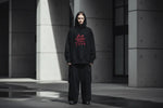
One character per fit. A neutral base — black, washed grey, faded rust — so the character carries the visual weight alone. Nothing else competing. The restraint isn't a style rule; it's what the format demands. A character is already the loudest thing a quiet garment can say.
Start with the lines that carry them: Kanji Dragon and Shinsei.